
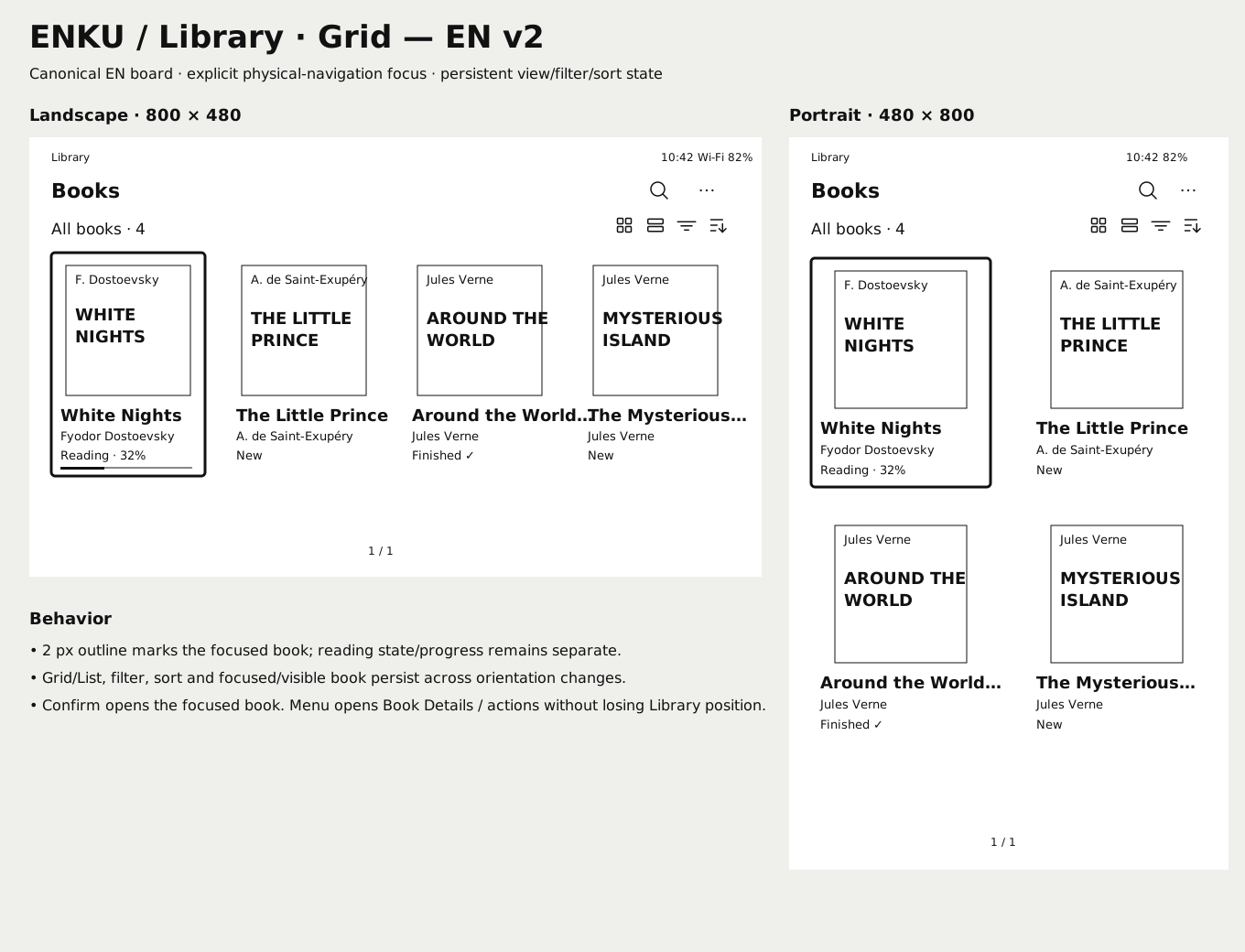
LibraryGRID · FOCUS · STATUS
DESIGN
ENKU is designed around monochrome e-paper and physical controls from the start. The interface favors clear hierarchy, stable focus, predictable back behavior and content-first reading instead of borrowing interaction patterns from touch devices.
CANONICAL SCREENS
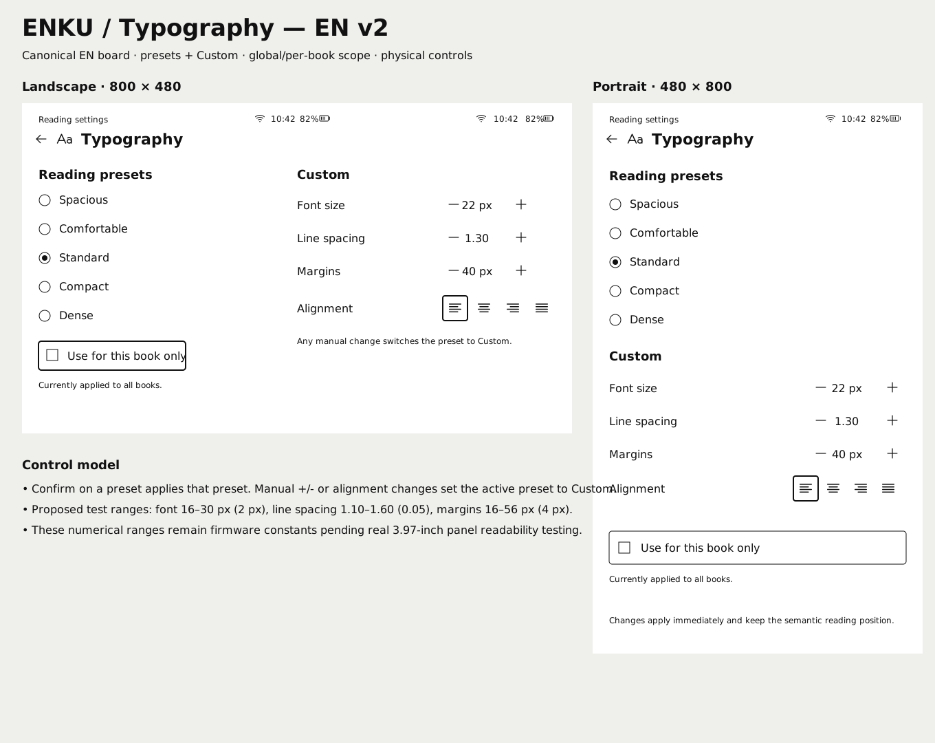
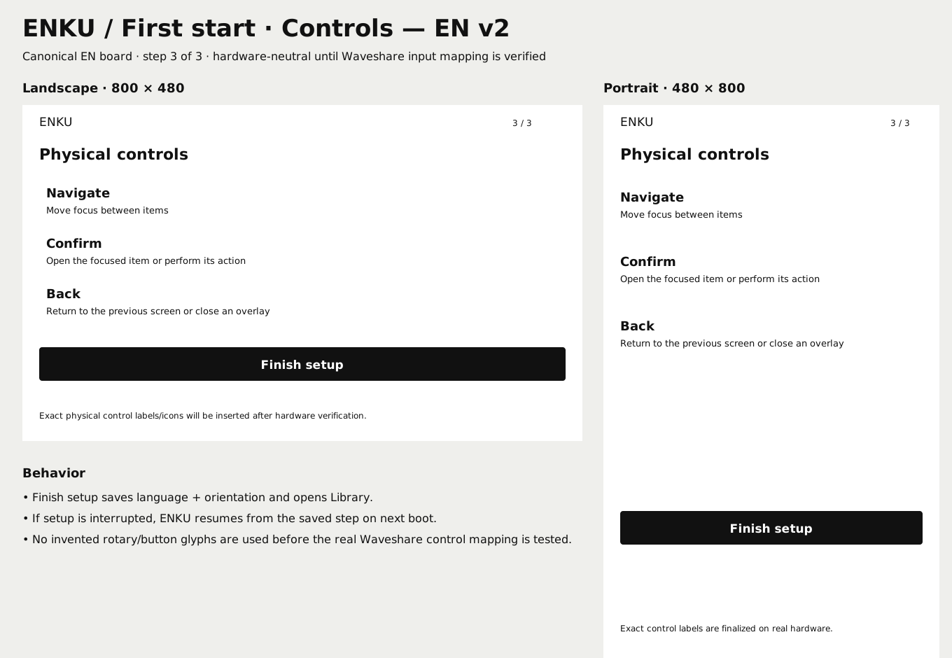
The repository keeps canonical English boards for implementation. Library, first-start, reading and settings flows share the same spacing, focus, icon and status-bar rules so screens can evolve without inventing interaction patterns independently.
INTERACTION RULES
The visual language is intentionally restrained, but the more important design work is behavioral: what owns focus, what Back means, which state persists and when a display refresh is worth paying for.
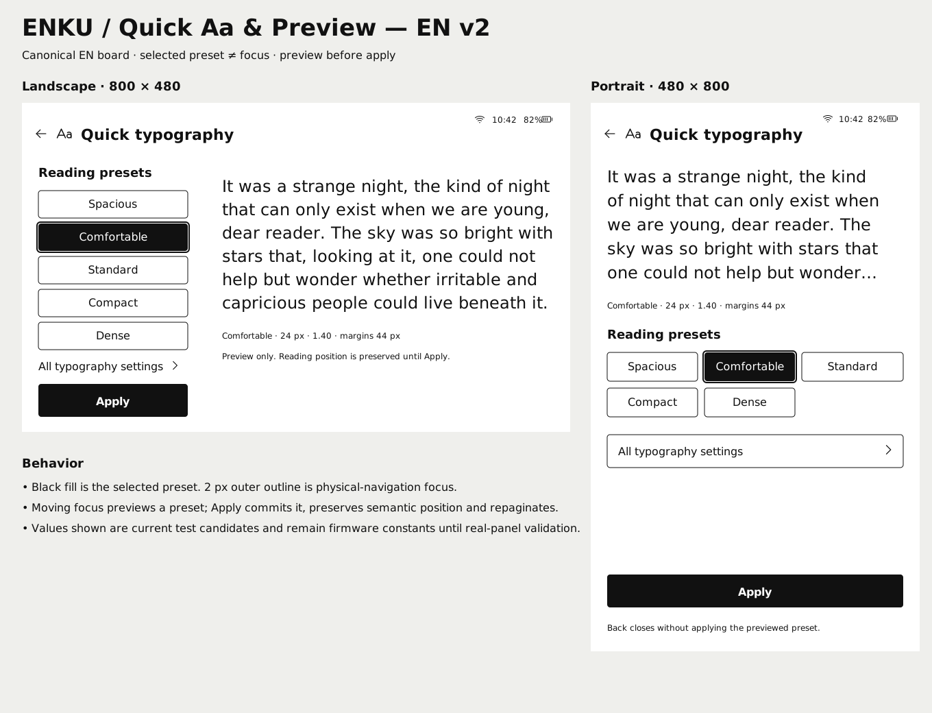
Reader chrome stays hidden by default. Menus and Quick Aa appear as explicit overlays without changing the underlying semantic reading position.
Every navigable screen has one understandable focus path for physical controls; long lists preserve focus and scroll context rather than resetting the user.
Clock and compact system indicators are designed to remain legible without dominating the book or Library content.
Layouts avoid animation assumptions. Visible transitions are grouped around meaningful state changes so full and partial refresh behavior can remain predictable.
Typography and orientation changes preserve semantic reading position, then repaginate around that anchor instead of treating the current framebuffer as state.
READING PRESETS
Typography presets change font size, line spacing and margins together. Manual adjustments move the book to Custom, while settings can remain global or be overridden for a single title.
Maximum breathing room for relaxed reading.
Generous spacing without sacrificing too much text.
The default balance for everyday reading.
More content while preserving clear rhythm.
Maximum text density for users who prefer it.
DESIGN SOURCE
The website shows a curated subset. Canonical SVG boards, screen inventory, audit notes and UI specifications remain versioned with the rest of the project.